
get started
Membership Management
Advertising network
Event Reporting
Last Update : August 2026
MemberLeap groups every event report into two dashboards: a per-event Reporting Dashboard that covers everything about a single event, and a cross-event All-Event Reporting dashboard that rolls financial and attendance data across every event in your organization. Both use the same tabbed layout, the same favoriting system, and the same global-search behavior. Once you've learned one, you've learned the other.
This article walks through both dashboards, the report tile pattern, the favorites system, and the search shortcuts. For the dedicated badge and sign-in sheet builders, see Section: Badge Builder and Section: Sign-In Sheet Builder.
Reporting Dashboard (per event)
The per-event dashboard is the one you'll spend most of your time in. To open it, go to the event list, click the Event Hub link on an event's card, then click Reporting Dashboard from the Attendees section of the hub.
The layout
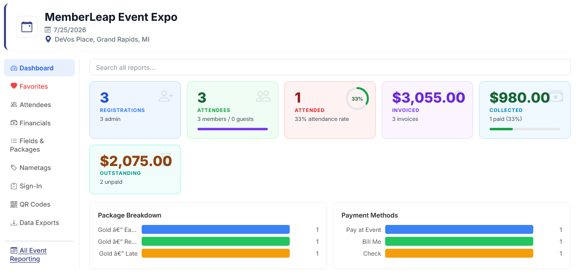
A vertical sidebar on the left lists the report categories. On the right is the active category's content. The currently-selected tab is highlighted in your organization's brand color; click any tab to switch.
The categories you'll see:
- Dashboard. A high-level overview: total registrations, total attendees, attendance percentage, invoiced amount, collected amount, outstanding amount, plus bar charts breaking down packages and payment methods. Comes with a global search box at the top.
- Favorites. Hidden until you favorite at least one report. Once you do, this tab collects all your favorited reports in one place. Detailed below.
- Attendees. Everything about who registered — searchable attendee tables, the Query Report Creator (a custom-filtered report builder), Member Match Tool, abandoned-registration cleanup, attendee itineraries, and any org-specific attendee exports.
- Financials. Payment-side reporting — payment status by attendee, full and unpaid invoice PDFs, fee breakdown, payment-method splits, and refund tracking.
- Fields & Packages. Reports about your custom fields and packages — field data grids, attendee-by-field rollups, selection counts, booth assignments, and package selection statistics.
- Nametags. The Badge Builder for custom-designed badges plus any saved templates for this event. Org-wide templates (starred) and legacy pre-built nametag layouts also live here.
- Sign-In. The Sign-In Sheet Builder plus saved sign-in templates. Legacy pre-built sheet formats are accessible behind the "Legacy Sign-In Sheets" tile.
- QR Codes. QR codes for the mobile app — one for the event, one per session, and (when rooms are enabled) one per room. Attendees scan these to check in or pull up session info.
- Data Exports. Bulk CSV and ZIP downloads — attendees (all / attended / no-shows), payments, invoices, individual attendee summary PDFs in bulk, transcripts, and field data exports.
The Dashboard tab
The default landing view shows live stats for the event in tile form: Registrations, Attendees with a member-vs-guest split, Attended with an attendance-rate donut, Invoiced, Collected, and Outstanding. Below the stats, two bar charts break down package selections and payment-method splits.
Everything on this tab updates in real time as new registrations, payments, and check-ins come in. There's no separate "refresh" step — a page reload always shows the current numbers.
Global report search
The search box at the top of the Dashboard tab is special: it searches across every report on every tab. Type any word or fragment and the page switches to a flat search-results view showing every report whose name or description matches. Click any result to open the report directly — you don't need to know which category it lives in.
This is the fastest way to find a specific report when you remember what you want but not where it is. Clear the search box to return to the normal dashboard view.
Report tiles and favorites
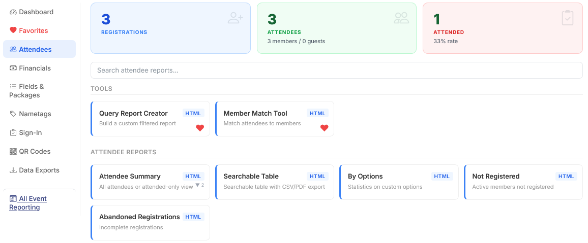
Inside every category tab, reports appear as small tiles. Each tile shows:
- A format badge in the top-left corner indicating what the report outputs (HTML, PDF, CSV, XML, ZIP).
- The report name and a one-line description.
- A heart icon in the top-right corner.
Click any tile to run that report. Some reports open in a new tab (you'll see the multi-arrow icon next to the format badge for these); others open in an overlay dialog where you fill in parameters (date range, attendee filter, etc.) before generating the report.
The heart icon adds or removes the report from your favorites. Favorited reports show up in the dedicated Favorites tab in the sidebar, so the handful you use every week are always one click away. Favorites are saved per-user, per-organization, so each admin can build their own quick-access list.
Multi-report tiles
A few tiles bundle several related reports under a single icon — you'll see a small downward-arrow badge next to the format badge with a count (e.g. "â–¼ 3"). Clicking the tile opens an overlay that lets you pick which variant to run. Examples: the Attendee Summary tile bundles the all-attendees and attended-only views, and the Pre-Reg CSV tile (when present) bundles several filter-by-status exports.
All-Event Reporting Dashboard
The all-event dashboard is for cross-event reporting — everything you'd want to know across every event in your organization rather than within a single one. Use it for monthly financial reports, year-over-year attendance trends, cross-event member transcripts, and any report that spans more than one event.
To open it, go to any event's Reporting Dashboard and click All Event Reporting in the breadcrumb action bar. Alternatively, on the per-event dashboard's sidebar, click the All Event Reporting link at the bottom.
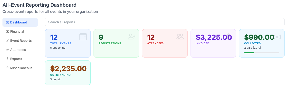
The layout is the same as the per-event dashboard: sidebar of categories on the left, content on the right. The categories are different because the reports are different:
- Dashboard. Live cross-event stats — total events, total registrations, total attendees, invoiced / collected / outstanding revenue across every event. Comes with the same global search box.
- Favorites. Your favorited cross-event reports.
- Financial. Invoice and transaction reports by event date, account-balance aging reports, AR snapshots, full invoice / payment exports with filters, fee breakdowns, and void tracking.
- Event Reports. Cross-event event-level rollups — graphing of top events by registrations or revenue, plus org-specific event-detail HTML reports.
- Attendees. Cross-event attendance reporting — Attendance Report, Member vs Non-Member CSV, Members Not Attended, Paid But Not Attended, and Contact / Transaction reports with discount filters.
- Exports. Event Detail CSV, member-batch transcripts and consolidated transcripts (for orgs with the transcript feature), and org-specific company reports.
- Miscellaneous. Specialty reports — Token usage, Adjudicator availability and acceptance, Copyright Compliance, ToY Point Status, and other feature-specific reports. Cards only appear when the underlying feature is enabled on the org.
Most reports here accept a date range. The defaults are sensible (last 30 days for transactional reports, year-to-date for historical ones), but every report lets you set your own range before running it.
Tips and patterns
- Run reports in new tabs. When a report opens in a new tab, you can flip back and forth between the dashboard and the report without losing your filters or place. Most HTML reports open this way by default.
- Favorite aggressively, then curate. The Favorites tab is more useful when it's populated. As you use the dashboard, favorite anything you've run more than once. Unfavorite later if it starts feeling cluttered.
- Search before scrolling. Even if you know which tab a report lives in, the global search on the Dashboard tab is often faster than clicking through — especially for reports with descriptive names.
- Take the in-app tour. Both dashboards have a guided tour. Click the play icon labeled "Take a Tour" in the breadcrumb bar at the top to walk through every category. Press Esc to exit.