
get started
Membership Management
Advertising network
Custom Fields
Last Update : August 2026
Custom fields are the extra questions you ask attendees during registration — everything beyond the standard contact info (name, email, address). Anything you want to know about each attendee that MemberLeap doesn't ask out of the box: meal choices, dietary restrictions, t-shirt sizes, session picks, golf handicaps, opt-in to a mailing list, special needs, additional donations.
This article walks through how to create and manage custom fields, the available field types, and the settings on the field editor. For the related topic of admin-only fields, see Section: Restricted Fields for Admins.
The Custom Fields tab
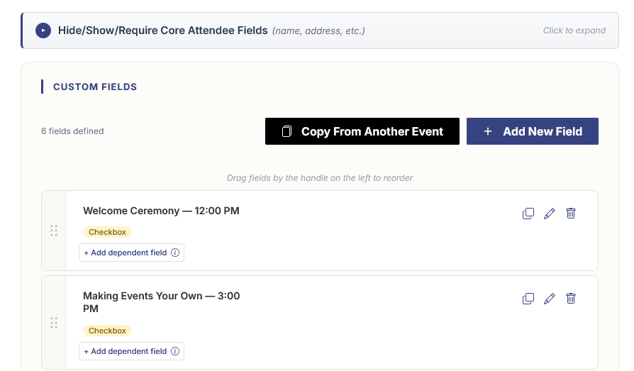
From the configuration editor, open the Custom Fields tab. The tab has two parts: the collapsible Hide/Show/Require Core Attendee Fields section at the top, and the list of custom fields you've added below it.
Hide/Show/Require Core Attendee Fields
This section controls the standard contact-info fields MemberLeap shows on every registration form: first name, last name, email, phone, address, city, state, ZIP, country, organization, and so on. For each one you can choose:
- Hide. The field doesn't appear on the registration form at all. Attendees aren't asked for it.
- Show. The field appears as optional — attendees can answer it but don't have to.
- Require. The field appears and must be filled in before the attendee can finish registering.
Use this to trim the form down to only what you actually need. A virtual webinar probably doesn't need a mailing address; a charity gala probably does. A networking event might require an organization name; a member-only members meeting probably won't. Changes here save automatically the moment you click a pill.
These controls only affect the public registration form. Admin-side data entry (adding an attendee from the Manage Attendees page) always shows every field regardless of how the toggles are set.
Action buttons
- Add New Field. Opens a panel that asks for the field type first, then drops you into the full field editor.
- Copy From Another Event. Opens a picker where you choose an existing event. All custom fields from that event are copied into this one. Great for annual events where the questions don't change year-to-year.
The field list
Each row is one custom field. From left to right, a row shows the drag handle, the field name and type, the cost (when applicable), and the action icons.
- Drag to reorder. Grab the handle on the left and drop the field into a new spot. The order is what attendees see on the registration form.
- Edit. Opens the field editor in a slide-out panel.
- Copy. Duplicates the field inside the same event. Handy for "this field but for a different session" patterns.
- Delete. Removes the field from the event. The delete prompt asks for confirmation. Note: if attendees have already answered the field, deleting it will affect their records and any reports that reference the data — be cautious on live events.
- Options. (Selection-type fields only.) Opens the editor for the field's available choices — see the Selection options section below.
Field types
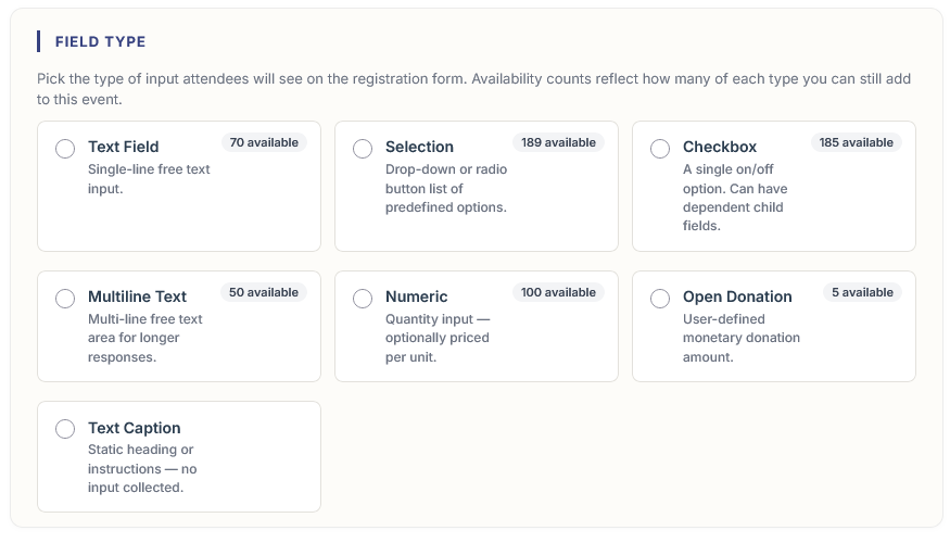
When you click Add New Field, MemberLeap asks you to pick a type before showing the rest of the editor. Each type has its own appearance on the registration form and its own set of settings.
- Text Field. A single-line free-text input. Use for short responses: a website URL, a phone extension, a vehicle plate, a badge nickname, a referral source.
- Selection. A drop-down (or radio buttons, with a checkbox setting) where the attendee can pick only one option from a predefined list. Use for meal choices, t-shirt size, breakout track, or anything else where exactly one answer applies. Selection options are configured in a separate editor — see below.
- Checkbox. A single on/off option. Use for opt-ins, "yes I have dietary restrictions," "include me in the photo," "I'll be bringing a guest." When you want attendees to be able to pick more than one option from a set (e.g. "which sessions are you attending" where they can attend multiple), set up a separate checkbox field for each option rather than a Selection field. Checkboxes can also have dependent child fields that only appear when the box is checked — for example, a "Yes, I have dietary restrictions" checkbox with a child text field asking for details.
- Multiline Text. A larger free-text area for longer responses. Use for emergency contact info, special accommodation requests, biography submissions.
- Numeric. A quantity input that can be priced per unit. Use for "how many extra meal tickets do you want at $25 each," "how many guest passes," or any "buy N of these" question.
- Open Donation. A monetary input where the attendee enters how much they want to donate. Useful for fundraising events. Only available on events that don't use a tax rate.
- Text Caption. Not a question — this type adds a static heading or block of instructions to the registration form between other fields. Use it to break up a long form, add a section header, or surface instructions inline.
After you pick a type, you can change it later by editing the field, but switching types after attendees have answered can produce unexpected results (e.g. text answers don't fit cleanly into a checkbox). Pick the right type at creation time when you can.
The field editor
The field editor opens as a slide-out panel and is organized into two sections: Field Basics covers what the field looks like and behaves like; Additional Field Options covers session metadata (location, date, time, speaker) and confirmation messaging.
Field Basics
- Field Name. The label attendees see next to the field on the registration form.
- Instructions. Optional helper text shown directly under the field name. Use it to explain what to enter, link to a policy, or clarify formatting.
- Available On Date and Cut-off Date. Optional date window. Available On hides the field until that day; Cut-off stops accepting responses after it.
- Cost and Openings Available (for chargeable types). For Numeric, Checkbox, and Selection-with-options fields you can set a cost and an opening count. Cost adds to the attendee's invoice when they pick the field. Openings caps how many total attendees can pick it.
- Field Image. Optional image that appears to the left of the field on the registration form. Use for branded session graphics, product shots, or sponsor badges.
- Entry Required and Restricted. Required forces an answer before checkout (available for text, selection, and multiline types). Restricted hides the field from the public form so only admins can pick or fill it — see Section: Restricted Fields for Admins.
- Attendance Tracking. When your organization has the attendance-tracking feature enabled, you can turn this on to track who actually showed up for this field/session, separate from who registered. When enabled, controls for CEU credit amounts and minimum check-in duration appear below it.
- Tie Field to Specific Packages. Check this to make the field appear only when the attendee picks one or more specific packages. Useful for package-specific add-ons or session selections that only apply to certain registration tiers. This is also the easiest way to scope a field by membership without setting permissions on the field directly: tie the field to a members-only package and only members will ever see it, since they're the only ones who can pick that package. Tie it to a guest-only package and only guests will see it. Permissions effectively trickle down from the package to every field that's tied to it — whatever rules gate the package also gate the field.
- Use as Radio Buttons (Selection fields only). Renders the field as a list of radio buttons instead of a dropdown. Good for small option lists (3-5 choices) where seeing all options at once is helpful.
Additional Field Options
This section is most useful for fields that represent sessions or scheduled blocks. Everything in here is optional.
- Field/Session Location. Where the session takes place — room name, virtual link, venue address.
- Field/Session Date, Start Time, End Time, Timezone. When the session happens. Used by the itinerary editor and by the calendar invite system.
- Hide Additional Data Fields During Registration. Hides the location, date, and time from attendees on the registration form. The data is still used internally for the itinerary and exports.
- Field/Session Speaker and Speaker Bio. Speaker name and rich-text bio. Surfaces on the public itinerary detail page.
- Add to Calendar links. When checked, attendees get an "Add to Calendar" link in their confirmation that creates a calendar event for this field. You can override the calendar event's location and description.
- Confirmation Verbiage. Rich-text block that appears on the confirmation summary and confirmation email when an attendee picks this field. Use it for "what to bring," parking notes, or post-registration instructions specific to this session.
Selection options
Selection-type fields need a list of options for the attendee to choose from. To manage them, click the Options action icon on the field's row in the Custom Fields list.
The options editor opens as a slide-out panel showing the existing options as cards. Each card can be edited, copied, deleted, or reordered. Use Add Option to create a new one. Each option has its own name, description, cost, capacity, schedule, and even its own confirmation verbiage. Options behave like mini-fields nested under the parent selection field.
This means a single Selection field like "Breakout Session Choice" can have options for each session, each with its own time, location, speaker bio, and capacity limit — without needing a separate field for each session.
Dependent (child) fields
Checkbox fields can have dependent child fields that only appear when the parent box is checked. Use this to ask a follow-up question only when it's relevant:
- A checkbox for "I have dietary restrictions" with a child text field for "Please describe."
- A checkbox for "I need lodging help" with a child selection field for which night and a child text field for any preferences.
To set up a dependent field, create the parent checkbox first, save it, then create the child field. The child field's options will include a "depends on" setting that points at the parent. Dependent fields appear in the list nested under their parent, with visual indentation and a marker, so you can see the relationship at a glance.
Tip: Take the in-app tour
The field editor has a guided tour. Click the play icon labeled "Take a Tour" in the panel header at the top to walk through every section. Press Esc to exit.